Treating an unwieldy online condition.
USA Health
Situation
15,189.
That’s how many pages the USA Health Website had when the client came to us. Their site had grown unwieldy, with segmented, hard-to-find, and sometimes outdated content. The user experience was wearying, not welcoming, because of its clumsy navigation and inconsistent design.

And the site architecture meant that searching the voluminous number of pages was a frustrating and often fruitless task. The client realized this was no way to present itself to patients who were seeking the expertise of an academic medical center.

Approach
A task this herculean was not to be solved overnight. In fact, it took months of disciplined research to inventory the site, audit its capabilities, interview key client personnel as the basis for more compelling content, and develop clear goals.
Ultimately, we agreed that a new site was needed to present a clear positioning statement for the brand, enhance the user experience, and improve site search, physician search, and lead generation, all while creating a solid technical foundation that provided measurable results and a platform for future growth.

Solution
A revamped positioning statement now takes center stage on the client’s home page. Navigation is streamlined so that users can find exactly what they want in two to three clicks.
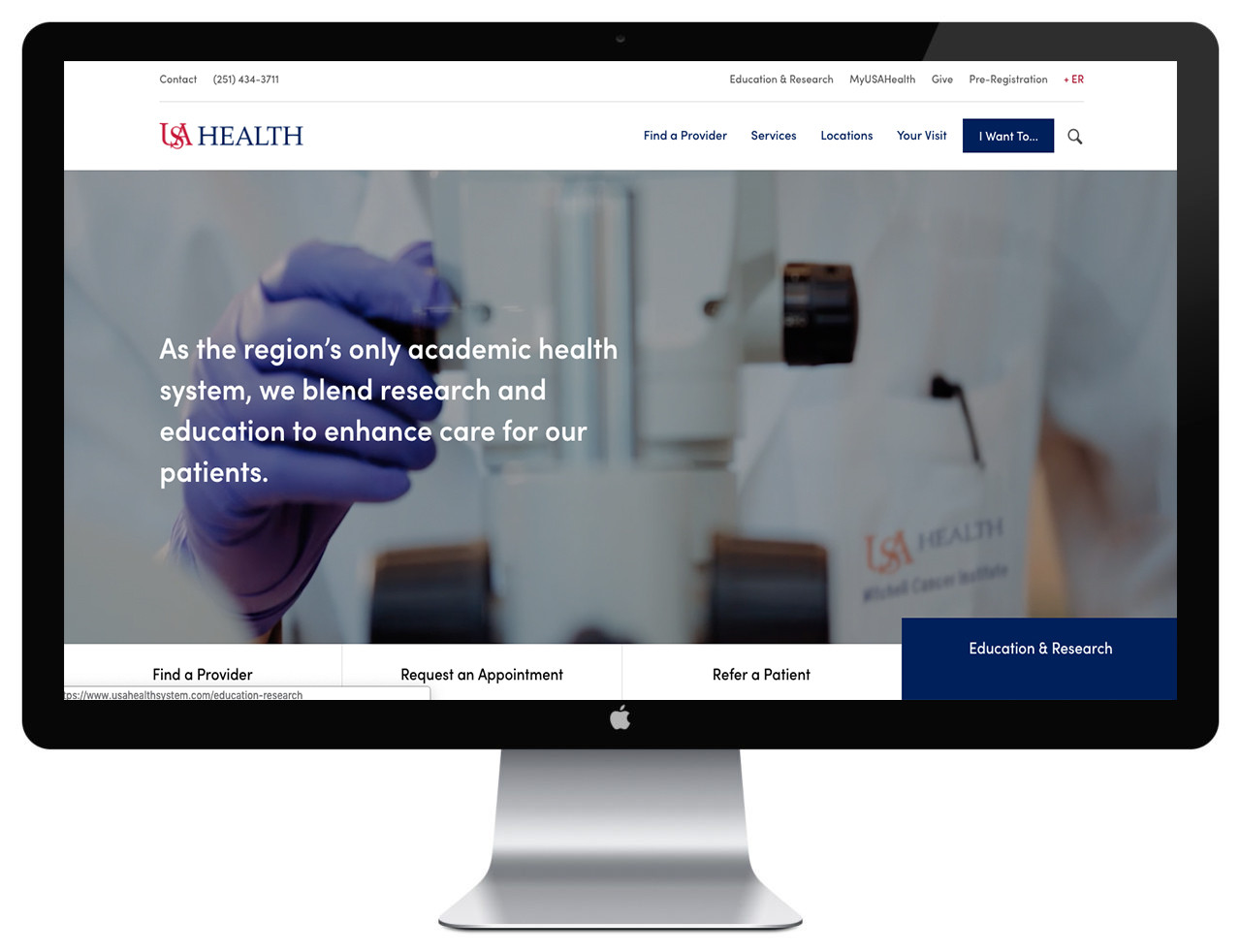
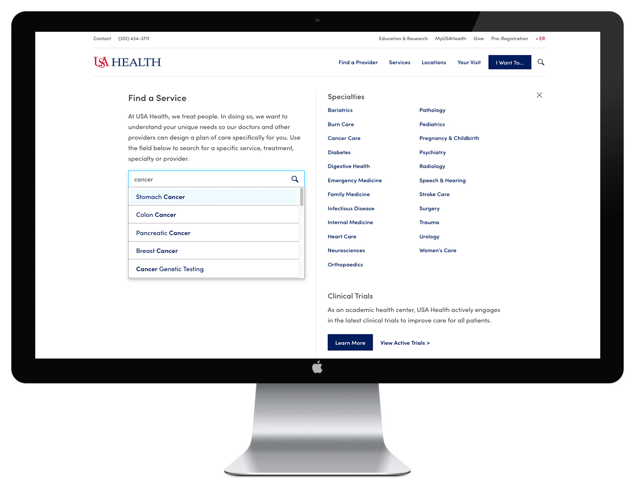
We utilized Swiftype search capabilities in order to provide users with a robust search experience where results are organized more intuitively.

We created a “provider online shopping experience” so that patients are now more readily finding a doctor that suits their needs.

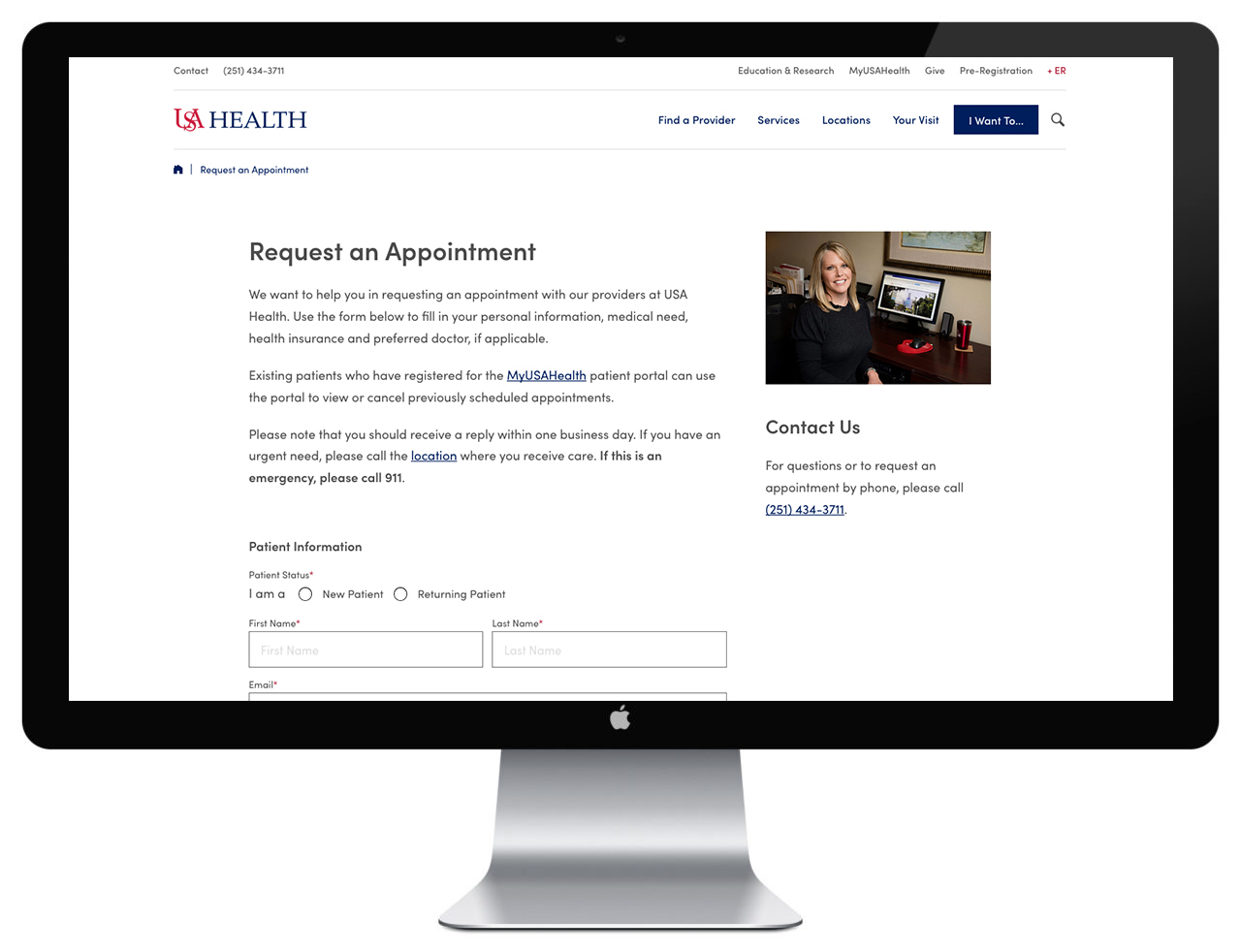
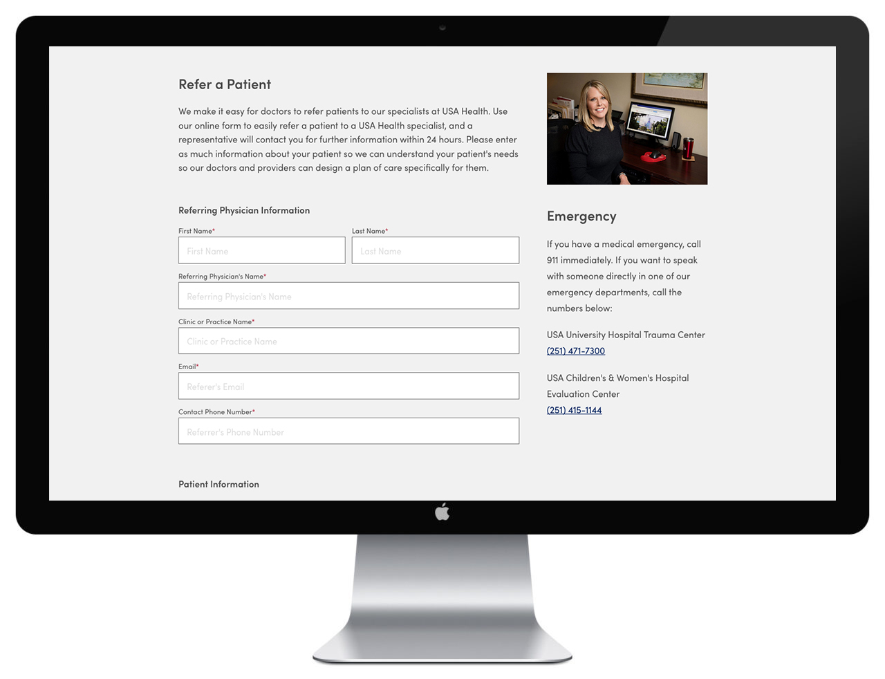
We created user-friendly tools such as “find a clinical trial,” “refer a patient online,” and “request an appointment” as well as other features to increase lead generation.
Of course, all of this would be for naught if we hadn’t built it on an SEO-friendly platform with a HIPAA-compliant database, which we did using Craft as the CMS and NEO as a plug-in that allows administrators to easily add modules to the pages.
Result
This project, nearly two years in the making, was always about results, and the early returns have not disappointed. Within the first month of this nearly 1,400-page site being live, the client saw over 475 appointment requests, 25 patient referrals, a 42% increase in sessions, a 45% increase in new users, a 22% increase in time spent on pages, and a 12% reduction in the bounce rate. In short, the client is feeling better about the site now. A lot better.
Vanderbilt University Medical Center
Hearts, minds and results.
- Healthcare

UVA Health
Turning competitors into partners.
- Healthcare


